As I contemplate my masters thesis, I’m looking for good examples of beginner-centric musical user interface design. Propellerhead’s new Figure app has been a source of inspiration for me. It’s mostly wonderful, and even its design flaws are instructive.
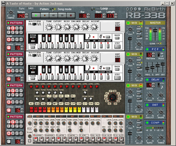
I have a long history with Propellerhead’s software, beginning with Rebirth in 1998. I’ve made a lot of good music with their stuff, but have also experienced a lot of frustration, mostly due to their insistence on slathering everything with unhelpfully “realistic” design.
Rebirth was designed to emulate the classic 303 bass synth and the 808 and 909 drum machines. Propellerhead did a nice job reproducing the sound of these devices. Unfortunately, they also chose to reproduce the original devices’ impenetrable user interfaces.
I could understand why Roland’s engineers put a step sequencer in the 303 back in the 80s, but forcing Rebirth users to step-sequence in a computer program in 1997 was practically sadistic. Rebirth has found new life as an iOS app, yet they’ve kept the perverse interface exactly the same.
Reason was a big improvement because it includes an actual MIDI editor, so you can produce the groovy vintage sounds using a more modern, flexible interface. But the design still leans too heavily on skeuomorphism. Reason is larded with nonfunctional “realistic” decoration to evoke physical hardware: screws, labels, vents. The functional interface elements are modeled after the knobs and displays from rack-mounted gear.
This aesthetic looks cool at first glance, and it’s well-targeted at Propellerhead’s hipster audience, but it swiftly becomes annoying. You have to mentally struggle to distinguish functional onscreen elements from decorative ones. The skeuomorphisms occupy valuable screen space, making the usable elements smaller and harder to read. Turning fake knobs with the mouse is needlessly difficult and imprecise. And if, like me, you used software for years before ever even seeing a vintage synth or analog compressor, the hardware metaphor is totally unhelpful. A simple boxes-and-arrows interface with black text on a white background would work a hundred times better. Part of the reason I moved from Reason to Ableton Live is that Ableton looks and works like a computer program. It has its own quirks, but at least everything on the screen has a function.
Figure has no skeuomorphism whatsoever. It’s all flat-colored polygons and large, friendly text. Everything on the screen is functional; nothing is decorative. Smartphone software forces these kinds of minimalist design choices just by virtue of the limited screen real estate, so iOS apps and mobile web sites tend to be easier on the brain than their desktop counterparts. Propellerhead took the mobile aesthetic and ran with it. Figure is their most attractive and least annoying product by a mile.
Propellerhead’s goal with Figure was to make maximally intuitive and effortless input methods. When they succeed, they succeed big, as they have with the little interface for choosing different rhythmic patterns. You just swipe your finger up and down, and the little ring representing the pattern gets broken up accordingly.
The chord change interface has a similar radial layout, with a big simple dot showing which chord is currently selected.
Most input in Figure is done by moving your fingertip around inside a rectangle. This paradigm works great for controlling the filters on the synths. Left/right controls frequency and up/down controls resonance. This makes sense; both parameters are continuous by nature, and moving your finger around playfully produces a nice two-dimensional interplay between them. However, the rectangles aren’t so hot for sequencing the drums and synths. Drum hits and synth notes fall on discrete rhythmic intervals and (in the case of the synths) pitches. It’s actually quite difficult to hit a specific beat or pitch with the rectangles, because there’s no indication as to which screen regions map to what beats or notes.
I can understand Propellerhead not wanting to overwhelm novice users, and the rectangles really do look cool. But they needlessly limit the app’s usefulness as a music-making tool. An “ice cube tray” model with rhythmic and pitch slots being unambiguously empty or full would be a huge help. The rectangles could be divided into discrete zones like comic book panels to retain the sleekly unified look.
The first version of Figure inexplicably had no way of saving or exporting your tune. Propellerhead rectified this glaring omission in the latest update, and they did a nice job. The default name for a new song isn’t “My Song” or something equally boring, it’s a randomly generated bit of Swedish-looking gibberish. This lets you know immediately that the name is something for you to replace. Alternatively, you can just keep the silly names; they’re better than “My Song,” “My Song 2,” “My Song 3” etc.
The mixer screen shows both the best and worst of Figure’s design. The relative volumes of the drums and two synths are shown by the height of three colored bars. Nothing could be more intuitive. However, the compressor (labeled Pump, unhelpfully) is a radial control showing a number from 1 to 100. I guess the number refers to the compression ratio, or output gain, or wet/dry mix, or some combination of the three? How is a non-expert supposed to know what it means? A graphic showing an audio waveform being squashed and boosted would be better.
Propellerhead’s goal with Figure is different from mine. I want to help you directly sequence your own rhythmic and melodic patterns. They want to get you past sequencing quickly and into the filters and effects, where most of the expression in techno music takes place. I want to make a tool, and they’re making a toy. But it is a really nice toy, and at one whole dollar, you can’t argue with the price tag.


